Reaches Quorum 1-13 and Fails. ~lilomar
Adminned at 24 Apr 2011 17:38:08 UTC
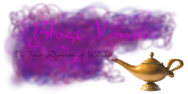
If this proposal passes, change the current website banner to the one before it.

Reaches Quorum 1-13 and Fails. ~lilomar
Adminned at 24 Apr 2011 17:38:08 UTC
If this proposal passes, change the current website banner to the one before it.
The previous banner didn’t have “The Eighth Dynasty of Kevan” on it. It didn’t have any text other than “Blognomic” on it.
Also, the current site banner was created as part of the previous gamestate.
Check out this image I made, I’m no graphic designer, but it’s better than nothing:

[Winner] Very nice, just a little thing: green on blue is hard to read, and does not look very good.
![]() Here’s my humble contribution to this header madness.
Here’s my humble contribution to this header madness.

In a few hours I’ll see if Syl* can make one.
*My sister, who created this a while back:
[Darth] That’s the one I had in mind. But Winner’s is nice too. May the Market choose wisely :P
![]() The only time the header sorta was gamestate was in Wak’s dynasty when a wayward wish added bill cosby to it lol. Ah the joy of filling in for Wak when he idled.
The only time the header sorta was gamestate was in Wak’s dynasty when a wayward wish added bill cosby to it lol. Ah the joy of filling in for Wak when he idled.
![]() Ooh, awesome. I personally like Winner’s first suggestion best, although the text might look better in a different colour, as Ely said.
Ooh, awesome. I personally like Winner’s first suggestion best, although the text might look better in a different colour, as Ely said.
I like winner’s first suggestion…all except for the big cut down the middle. (and the text color) How about this?

![]() Good one from lilomar. It’s generally good to keep the vertical height down, so that users with smaller browser windows don’t have to scroll past it to see if there’s a new post, every time.
Good one from lilomar. It’s generally good to keep the vertical height down, so that users with smaller browser windows don’t have to scroll past it to see if there’s a new post, every time.
Not sure how to post a pic on here, but I’ll try this:

[img src=“http://i52.tinypic.com/jaklsn.jpg”]
BlogNomic is powered by pMachine ExpressionEngine.

lilomar:
The banner isn’t really gamestate, although I believe it has been declared so from time to time. Generally, the current Emperor will change it once he creates, or has someone else create) the new banner.
I’m also not sure why you want to change it back to the Eighth of Kevan, as we are now in the Fourth of Purplebeard.